For this week’s blog post, we would like to describe our continuing efforts in exploratory data analysis. This week, we will try to do a deeper analysis and also try to put together more polished figures.
For this week’s blog post, we would like to describe our continuing efforts in exploratory data analysis. This week, we will try to do a deeper analysis and also try to put together more polished figures.
For EDA analysis, we start by loading the cleaned dataset:
library(tidyverse)## ── Attaching packages ─────────────────────────────────────── tidyverse 1.3.1 ──## ✓ ggplot2 3.3.5 ✓ purrr 0.3.4
## ✓ tibble 3.1.2 ✓ dplyr 1.0.7
## ✓ tidyr 1.1.4 ✓ stringr 1.4.0
## ✓ readr 2.0.1 ✓ forcats 0.5.1## ── Conflicts ────────────────────────────────────────── tidyverse_conflicts() ──
## x dplyr::filter() masks stats::filter()
## x dplyr::lag() masks stats::lag()library(sf)## Linking to GEOS 3.8.1, GDAL 3.2.1, PROJ 7.2.1library(tmap)## Registered S3 methods overwritten by 'stars':
## method from
## st_bbox.SpatRaster sf
## st_crs.SpatRaster sfmortgage <-read_csv(here::here('dataset','dcr_clean.csv'))## Rows: 619660 Columns: 32## ── Column specification ────────────────────────────────────────────────────────
## Delimiter: ","
## chr (3): state_orig_time, month, day
## dbl (29): id, time, orig_time, first_time, mat_time, res_time, balance_time,...##
## ℹ Use `spec()` to retrieve the full column specification for this data.
## ℹ Specify the column types or set `show_col_types = FALSE` to quiet this message.Firstly, we would like to have a quick look at the total number of mortgages in the US in each year.
mortgage %>% group_by(year) %>% summarise(n = n_distinct((id))) %>% ggplot(aes(x = year, y = n ))+geom_line() + geom_point() + labs(y = 'Total Mortgage')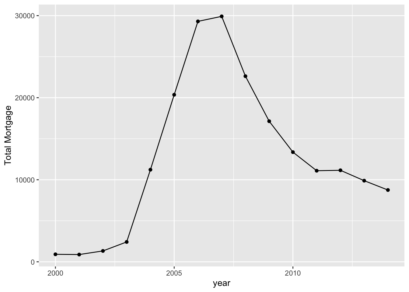
mortgage %>%count(time, gdp_time) %>% ggplot(aes(x = time, y = gdp_time)) + geom_point()+geom_line() + labs(y = 'GDP Growth')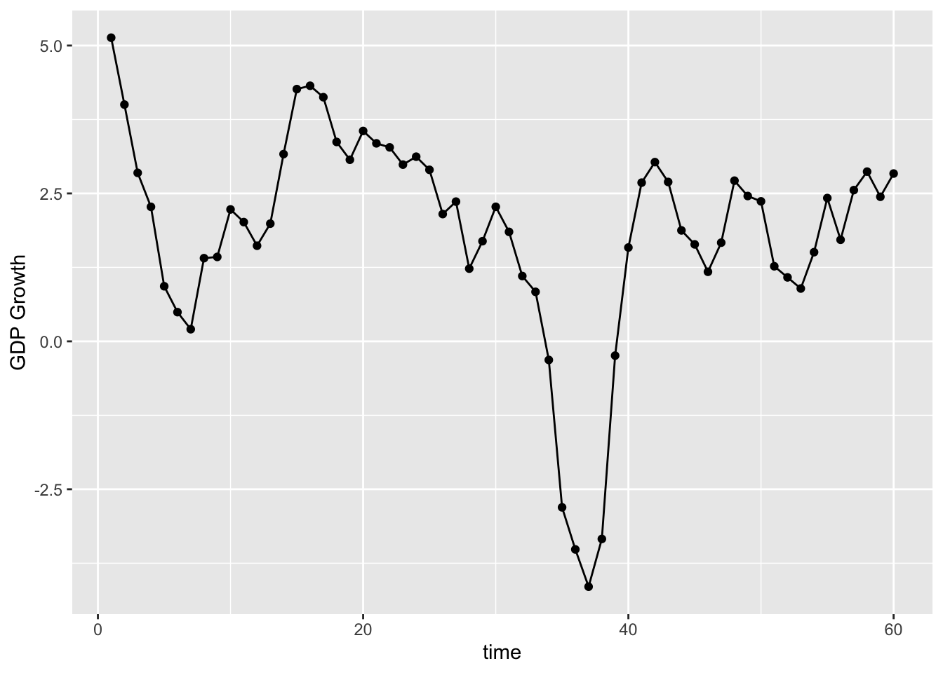
As we can see that the mortgage market is rising in the US from 2000 to 2007. The market rises dramatically especially after 2004. However, during the 2008, number of mortgage sharply decreases. The number was cut by almost 200% by 2010 compared to 2007. We believe that the government might pose harsher regulation on mortgage after the economy crisis.
We would also like to see the the number of mortgage across different regions in the US.
mortgage_last<-mortgage %>% group_by(id) %>%  summarise_all(last)
epsg_us_equal_area <- 2163
us_states <- st_read(here::here("dataset/cb_2019_us_state_20m/cb_2019_us_state_20m.shp"))%>%
  st_transform(epsg_us_equal_area)
## Reading layer `cb_2019_us_state_20m' from data source
## `/Users/alex/Desktop/fa2021-final-project-digfora/dataset/cb_2019_us_state_20m/cb_2019_us_state_20m.shp'
## using driver `ESRI Shapefile'
## Simple feature collection with 52 features and 9 fields
## Geometry type: MULTIPOLYGON
## Dimension: XY
## Bounding box: xmin: -179.1743 ymin: 17.91377 xmax: 179.7739 ymax: 71.35256
## Geodetic CRS: NAD83not_contiguous <-
c("Guam", "Commonwealth of the Northern Mariana Islands",
"American Samoa", "Puerto Rico", "Alaska", "Hawaii",
"United States Virgin Islands")
us_cont <- us_states %>%
filter(!NAME %in% not_contiguous) %>% filter(NAME != "District of Columbia") %>%
transmute(STUSPS,STATEFP,NAME, geometry)
q <- mortgage_last %>% group_by(state_orig_time) %>% summarise(n = n())
us_cont %>% inner_join(q, by = c("STUSPS" = "state_orig_time")) %>% tm_shape() + tm_polygons(col = "n",palette = "RdBu") 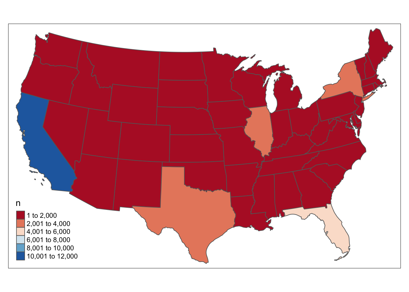
CA and FL leads to the number of mortgages in the US.
As follows, we would like to have a closer look on the value distribution of the mortgage in the US.
mortgage %>% count(id, balance_orig_time) %>% ggplot() + geom_histogram(aes(balance_orig_time))+ xlim(0, 1500000) + labs(x = 'Mortgage Value',y = 'Total Number')## `stat_bin()` using `bins = 30`. Pick better value with `binwidth`.## Warning: Removed 86 rows containing non-finite values (stat_bin).## Warning: Removed 2 rows containing missing values (geom_bar).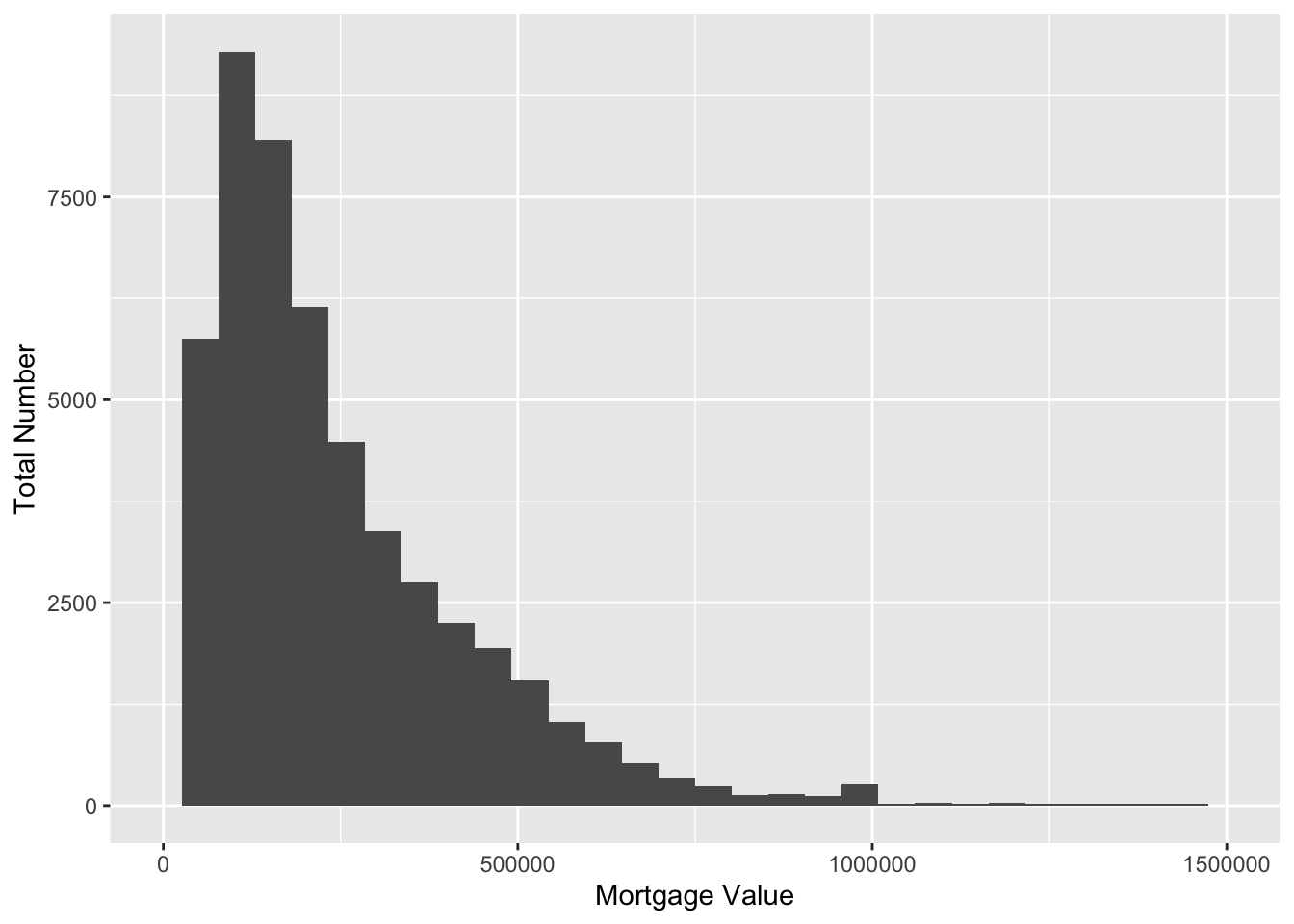
We can see that the mortgage value in the US is right skewed distributed, with enormous amount in 100000 to 500000 dollars, and little amount bigger than 1000000. This is expected cause most can only afford cheaper houses.
We would also like to have a look at the types of mortgage differed by payment time in the US.
mortgage %>% mutate(duration = (mat_time - orig_time)/4) %>% ggplot() + geom_histogram(aes(duration))## `stat_bin()` using `bins = 30`. Pick better value with `binwidth`.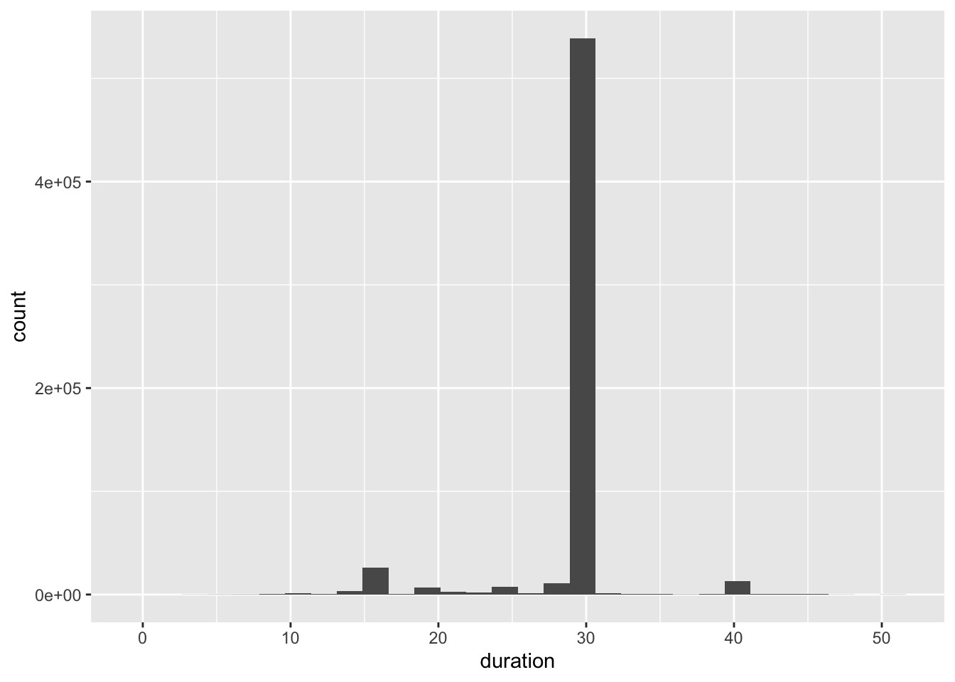
We can see that enormous amount of the mortgages in US are 30 years, with little in 15 and 40 years.
Since this is a panel dataset, multiple records may refer to the same mortgage, so we would also like to look at the number of newly issued mortgages each year.
mortgage_first<-mortgage[match(unique(mortgage$id), mortgage$id),]
mortgage_first_count<-mortgage_first %>% group_by(time) %>% summarise(n = n_distinct((id)))
time<-data.frame(seq(1,60,1))
colnames(time)<-'time'
mortgage_first_count<-merge(mortgage_first_count,time,by='time', all = TRUE)
mortgage_first_count$n<-mortgage_first_count$n %>% replace_na(0)

ggplot(mortgage_first_count, aes(x = time)) +
  geom_line(aes(y = n, color = "first_morgage_number")) + labs(y = 'number of new mortgages')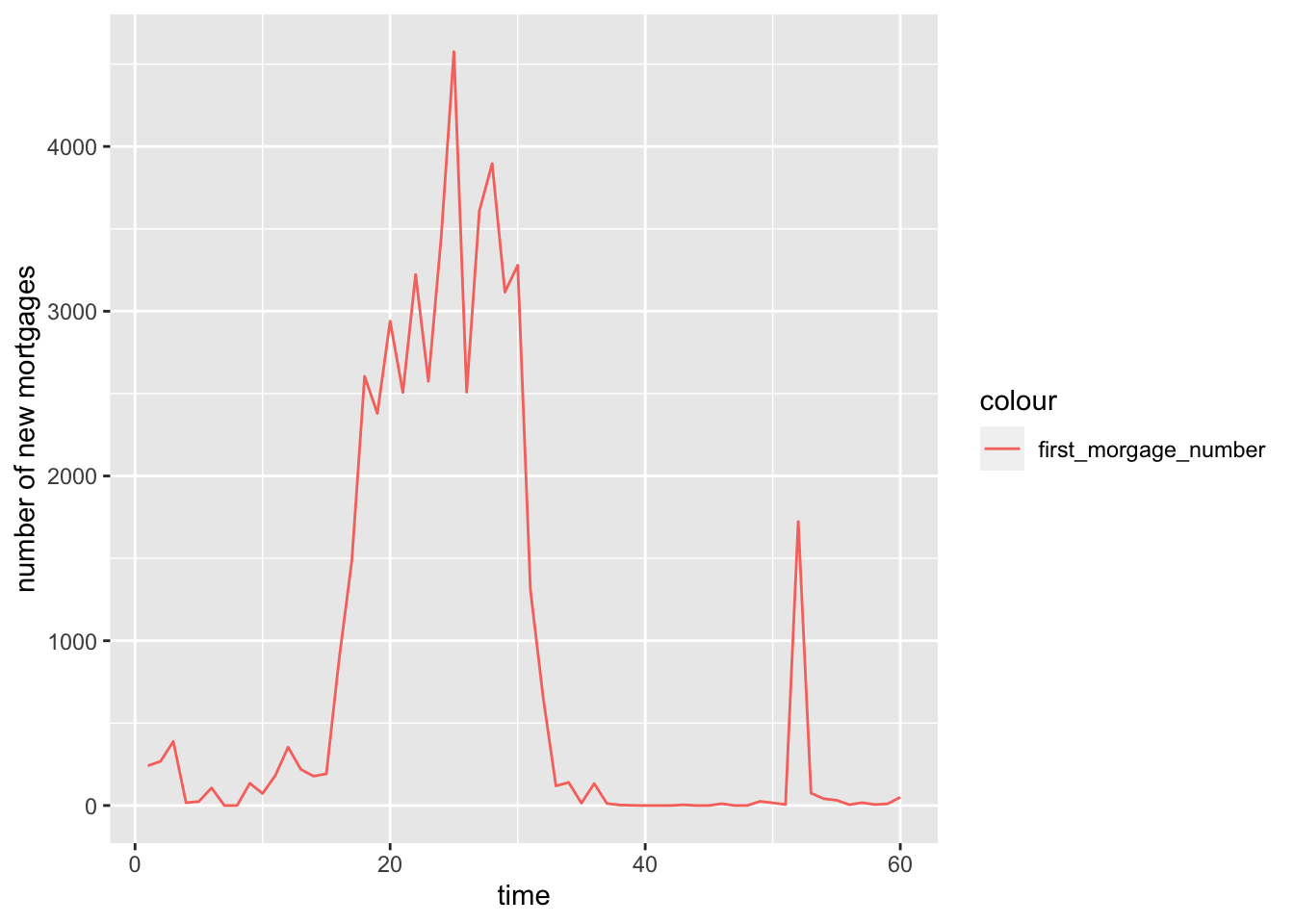
The number of newly issued mortgage is rising dramatically from time period 15 to 35, and follows with a sharp drop.
As followed, we would like to compare the growth rate of both GDP and new mortgage in 60 periods in one spot to see their relationships between mortgage and us economy. Here, to make both comparable, we times gdp growth by 1000.
mortgage %>% count(time,gdp_time) %>% left_join(mortgage_first_count, by = 'time') %>% ggplot(aes(x = time)) + geom_line(aes(y = n.y, color = "number_of_new_morgages")) +
  geom_line(aes(y = gdp_time*1000, color = "gdp_time")) + labs(y = 'Orange: NUmber of New Mortgages')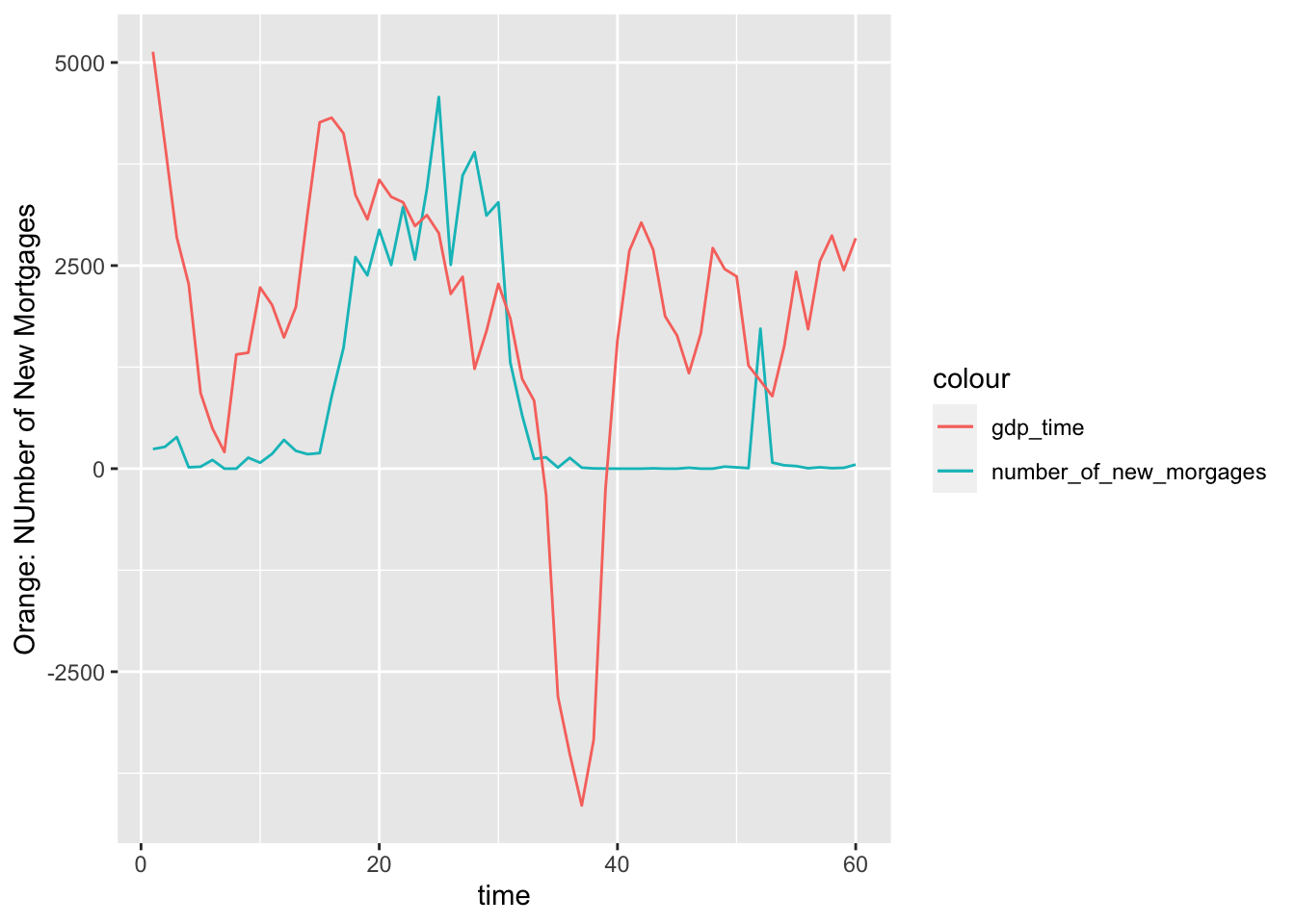
The rise and drop of both rates are strongly related. Before the economy crisis, the rise of US economy also comes with the increase of mortgage, since more and more people are confident that they can pay off some day. The excess amount of mortgage then leads to the economy crisis. We can see that number of newly issued mortagage decreases to nearly 0 with negative GDP growth.
We would also like to look at the growth of mortgage and interest rate. To make both comparable, we times interest rate by 500.
interest <- mortgage %>%group_by(time) %>%summarize(mean(interest_rate_time)) %>% left_join(mortgage_first_count, by = 'time')
colnames(interest)[2]<-'interest_rate'
  ggplot(interest,aes(x = time)) + geom_line(aes(y = n,color = "number_of_new_morgages")) + geom_line(aes(y = interest_rate*500, color = "Interest Rate")) + labs(y = 'Orange: NUmber of New Mortgages')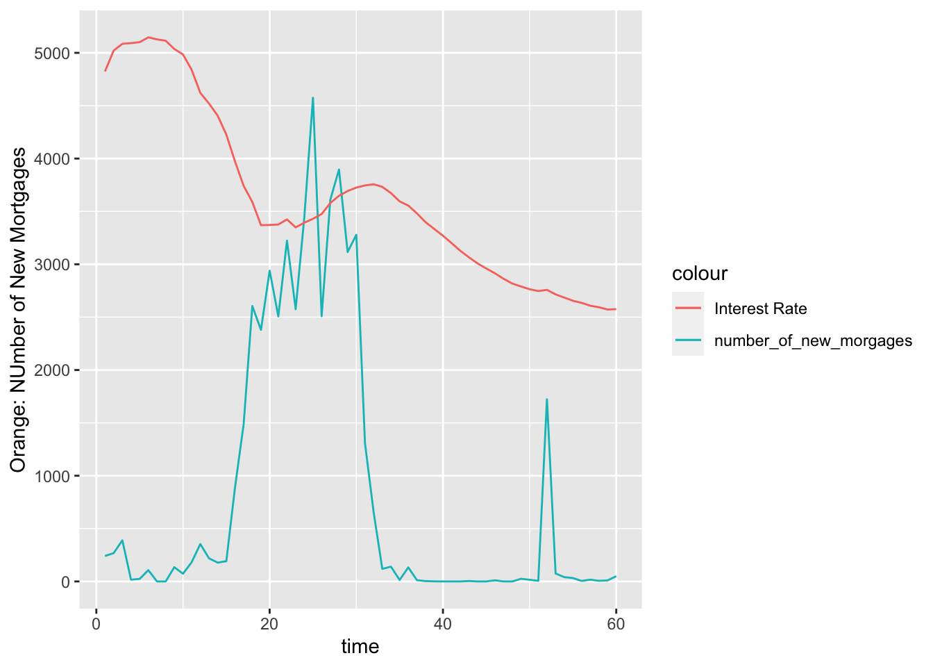
This is also what we expected, before the economy crisis, the interest rate decreased dramatically from 0 to 20 period. More and more mortgage are issued because of low interest rate. As followed, the interet rate increases, more and more people then cannot pay off their debt, which leads to economy crisis and decrease of mortgage.
After reviewing the whole data set, we then need to take a closer look at default rate, which is what we want to model.
In the status time column, 0 stands for unfinished, 1 stands for pay_off, 2 stands for default. We would first like to see how many people are pay off,defualt or unfinish.
ggplot(mortgage_last)+geom_bar(aes(x = status_time)) + labs(x = '0:Unfinished , 1: Default , 2: Payoff')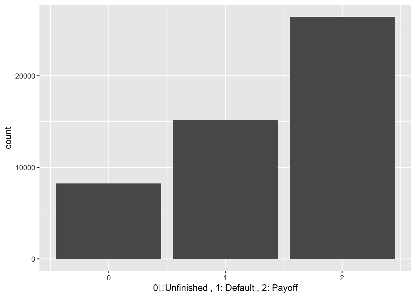
About 15000 household are default, 25000 are pay off, and 8000 are unfinished.
We would like to see the how default rate changes with the time
f <- mortgage %>% filter(default_time == 0) %>% count(time, default_time)
mortgage %>% filter(default_time == 1) %>% count(time, default_time) %>% left_join(f, by = 'time') %>% mutate(default_Rate = n.x/n.y) %>% ggplot(aes(x = time, y = default_Rate)) + geom_line(color = 'Blue')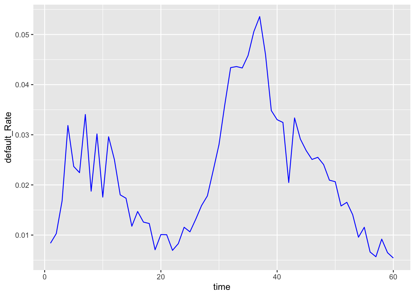
As we expeceted, lots of household default in period 37, which corresbond to the economy crisis.
We also hope to determine if credit score can affects one’s default rate:
ggplot(mortgage_last, aes(x = FICO_orig_time)) +
    geom_histogram(data=subset(mortgage_last,status_time == 1),fill = "red", alpha = 0.2) +
    geom_histogram(data=subset(mortgage_last,status_time == 2),fill = "blue", alpha = 0.2) +
    geom_histogram(data=subset(mortgage_last,status_time == 0),fill = "green", alpha = 0.2)
## `stat_bin()` using `bins = 30`. Pick better value with `binwidth`.
## `stat_bin()` using `bins = 30`. Pick better value with `binwidth`.
## `stat_bin()` using `bins = 30`. Pick better value with `binwidth`.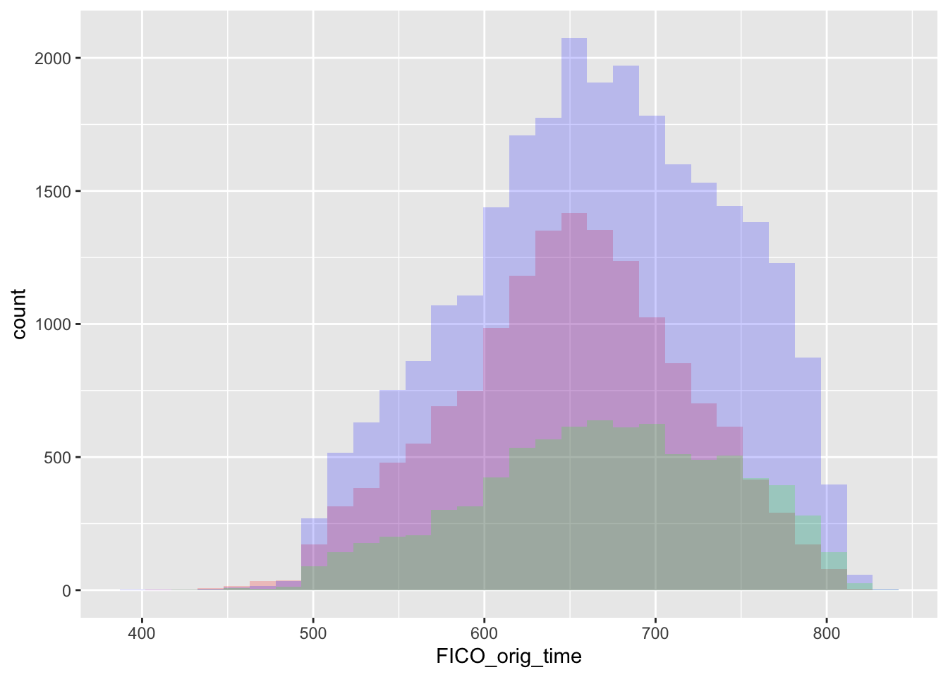
Appratently, credit score is not the main indicator for defualts.Therefore, default rate might be more related to interest rate and GDP growth.
Then we would like to compare the defaults across different regions in the US. We would first looks at the number of default across different states:
mortgage_1 <- mortgage %>% filter(status_time == 1) %>% group_by(state_orig_time) %>% summarize(count = n()) %>% select(state_orig_time, count)
US_mortgage <- us_cont %>% inner_join(mortgage_1, by = c("STUSPS" = "state_orig_time"))
tm_shape(US_mortgage) + tm_polygons(col = "count",palette = "RdBu") + tm_shape(US_mortgage) + tm_borders()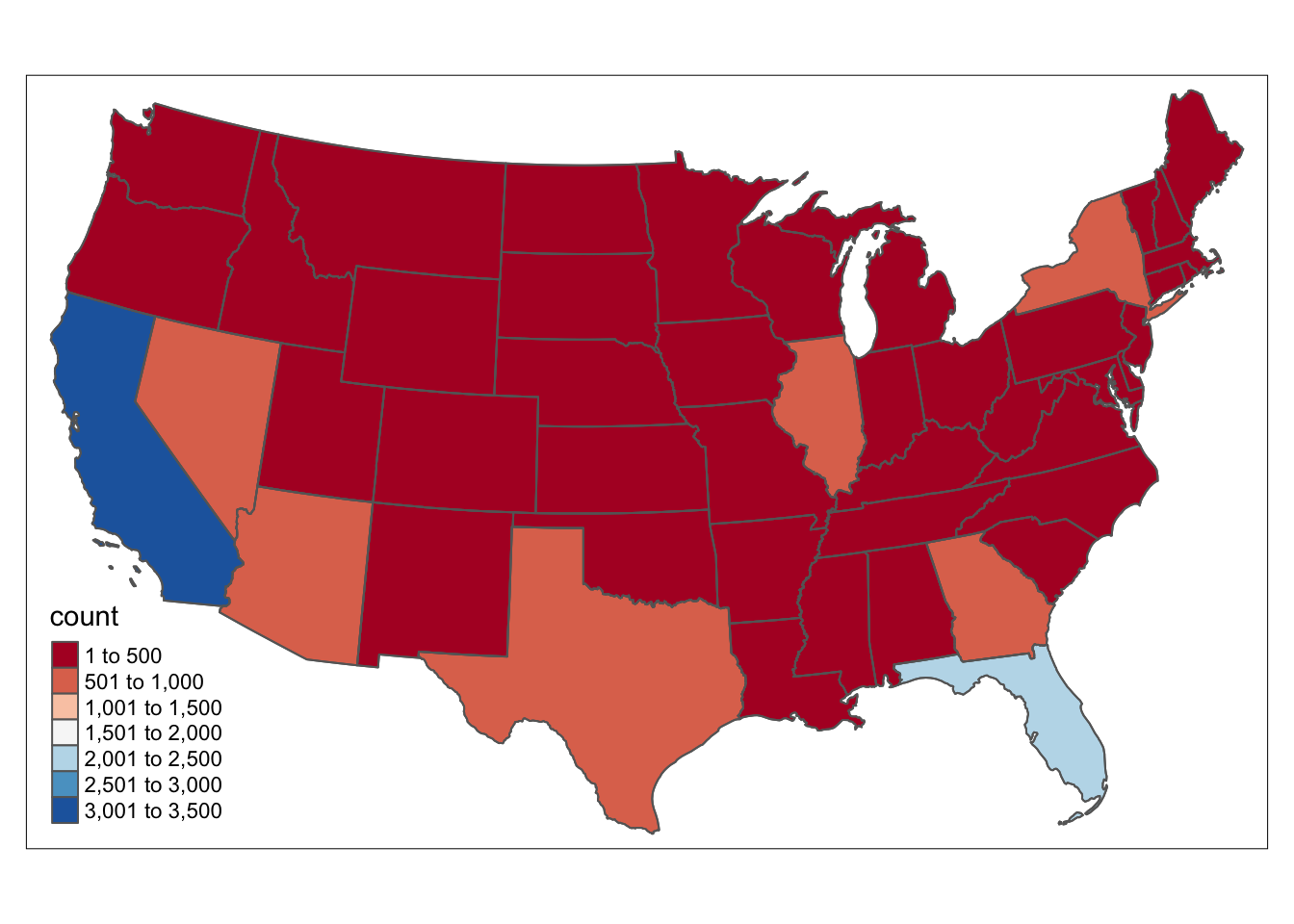
The number of defualt mortgage is CA and FL is very large, which can be our future focus.
With CA and FL, We are unable to see the situation of other states. We then try to exclude these two states to see the number of defualts.
mortgage_2 <- mortgage_1 %>% filter(state_orig_time != "CA") %>% filter(state_orig_time != "FL")
US_mortgage_2 <- us_cont %>% inner_join(mortgage_2, by = c("STUSPS" = "state_orig_time"))
tm_shape(US_mortgage_2) + tm_polygons(col = "count",palette = "RdBu") + tm_shape(US_mortgage_2) + tm_borders()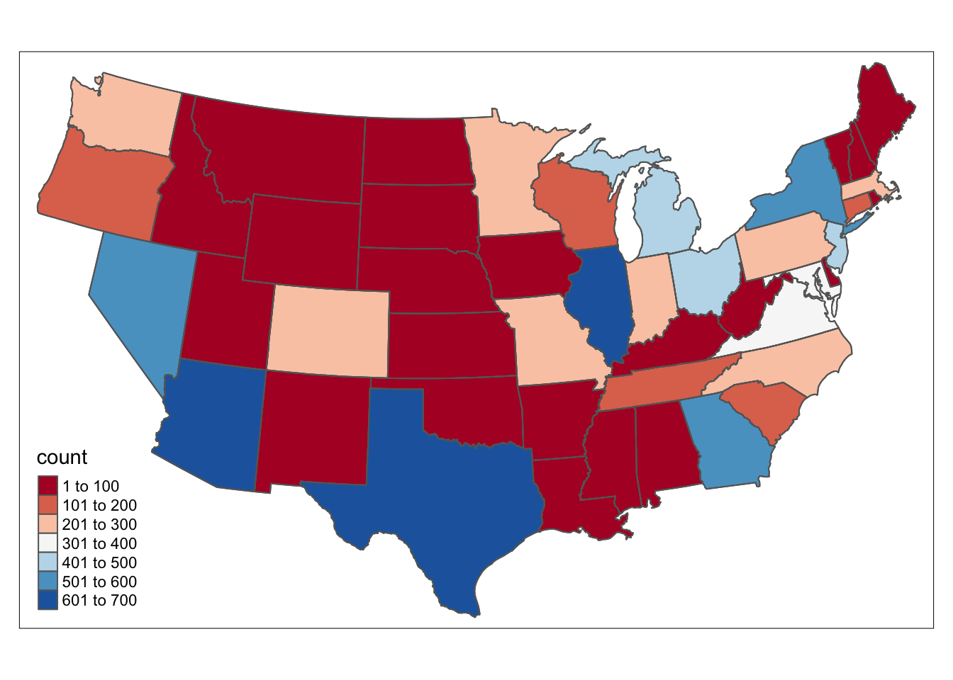
We can see that number of defaults happens more frequently in east and west part of US, with more mortgage and more active economy.
As followed, we would like to see the total value of defualt loan across different regions in the US.
mortgage_3 <- mortgage %>% filter(status_time == 1) %>% group_by(state_orig_time) %>% summarize(sum = sum(balance_time)) %>% select(state_orig_time, sum)
US_mortgage_3 <- us_cont %>% inner_join(mortgage_3, by = c("STUSPS" = "state_orig_time"))
tm_shape(US_mortgage_3) + tm_polygons(col = "sum",palette = "RdBu") + tm_shape(US_mortgage_3) + tm_borders()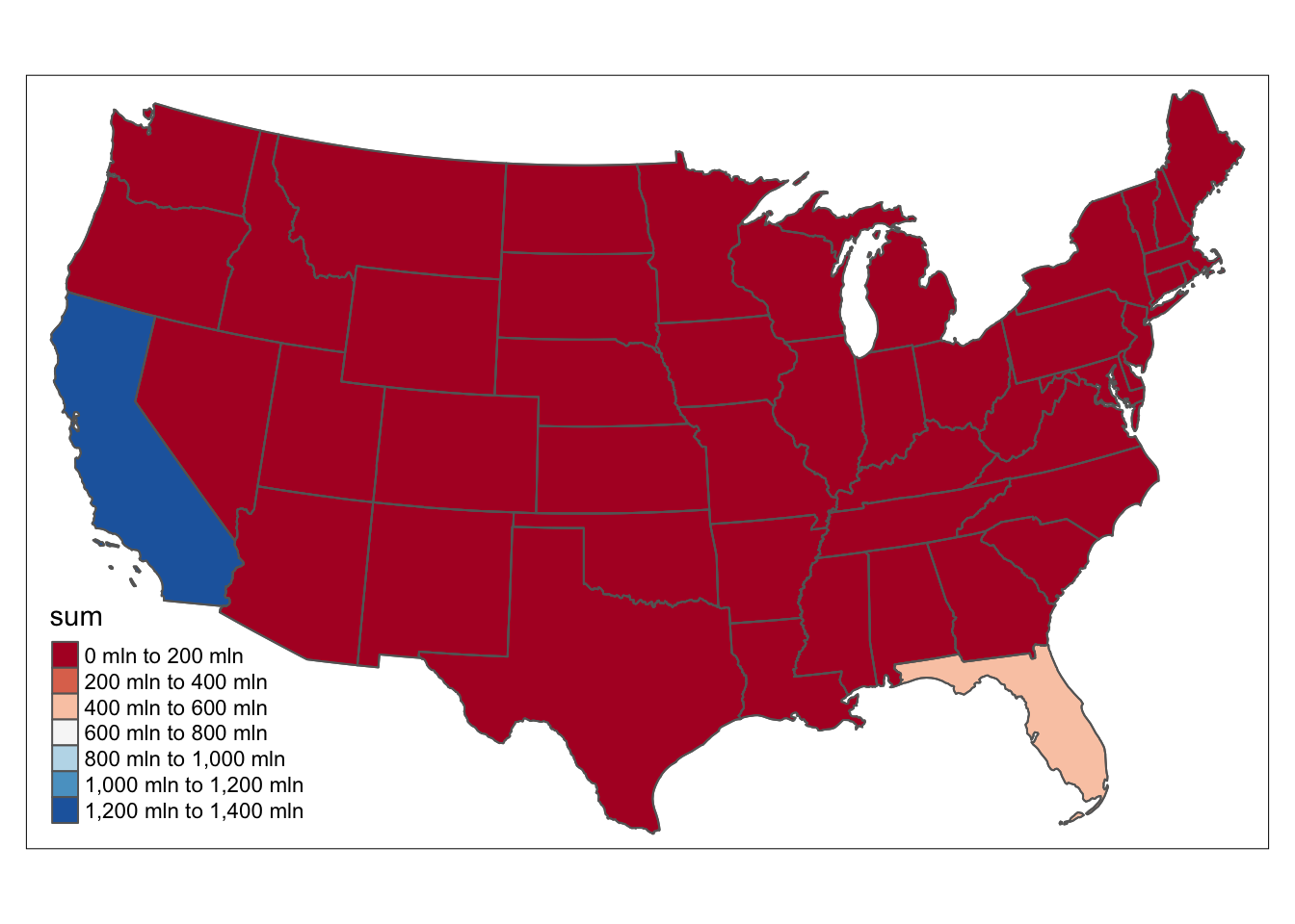
CA and FL stills leads in this situation with dramatic amount of mortgages.
We then try to exlcude the two states to see situation elsewhere.
mortgage_4 <- mortgage_3 %>% filter(state_orig_time != "CA") %>% filter(state_orig_time != "FL")
US_mortgage_4 <- us_cont %>% inner_join(mortgage_4, by = c("STUSPS" = "state_orig_time"))
tm_shape(US_mortgage_4) + tm_polygons(col = "sum",palette = "RdBu") + tm_shape(US_mortgage_4) + tm_borders()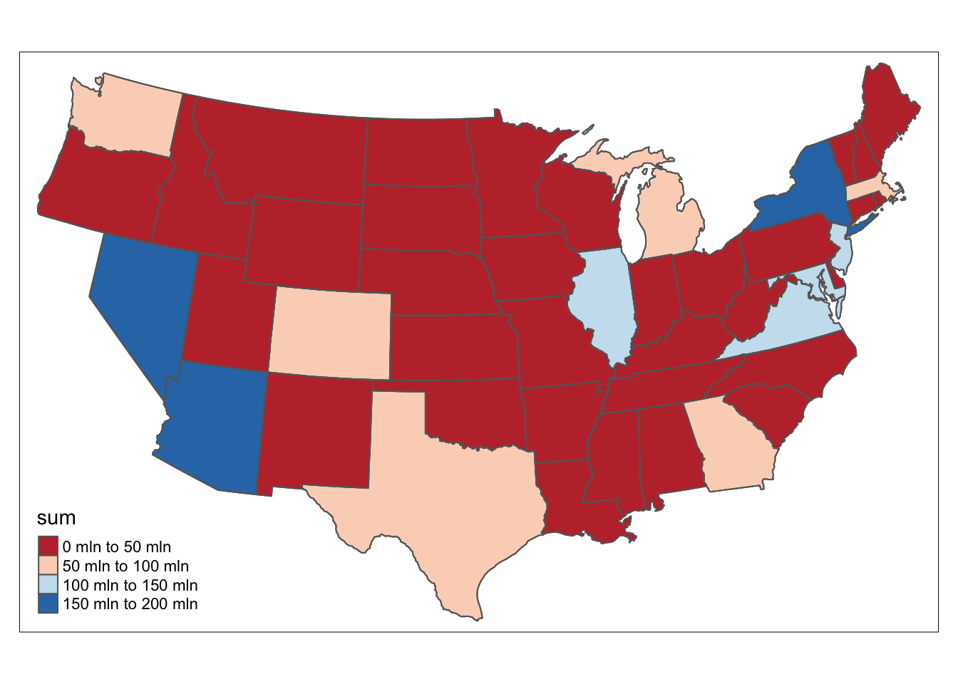
The east and west coast is still the places with largest value of default loan.
After all these analysis, we believe that default of Mortgage are more related to US economy and interest rate, there indicators will be our future focus in building the model.